
Pierson
Print
Based in Temecula, CA, a well-established brand approached our studio seeking a complete refresh. Guided by the mantra “Leaving Your Mark,” we helped elevate their identity as a marketing company offering a wide range of services, including Custom Apparel Solutions, Event & Facility Branding, Branded Merchandise Solutions, and Design & Installation Services.
Lead Designer & Creative Director
Ricky Peterson
Project Timeline
2.5 Months
BRAND DNA
From the very beginning, the concept was clear: a fingerprint symbolizing the slogan “Leaving Your Mark.” This idea became the foundation of the brand identity, with fully custom fingerprint graphics integrated across various assets. To complement this, typography was chosen with care—striking the right balance between creativity and professionalism while maintaining a strong corporate feel.


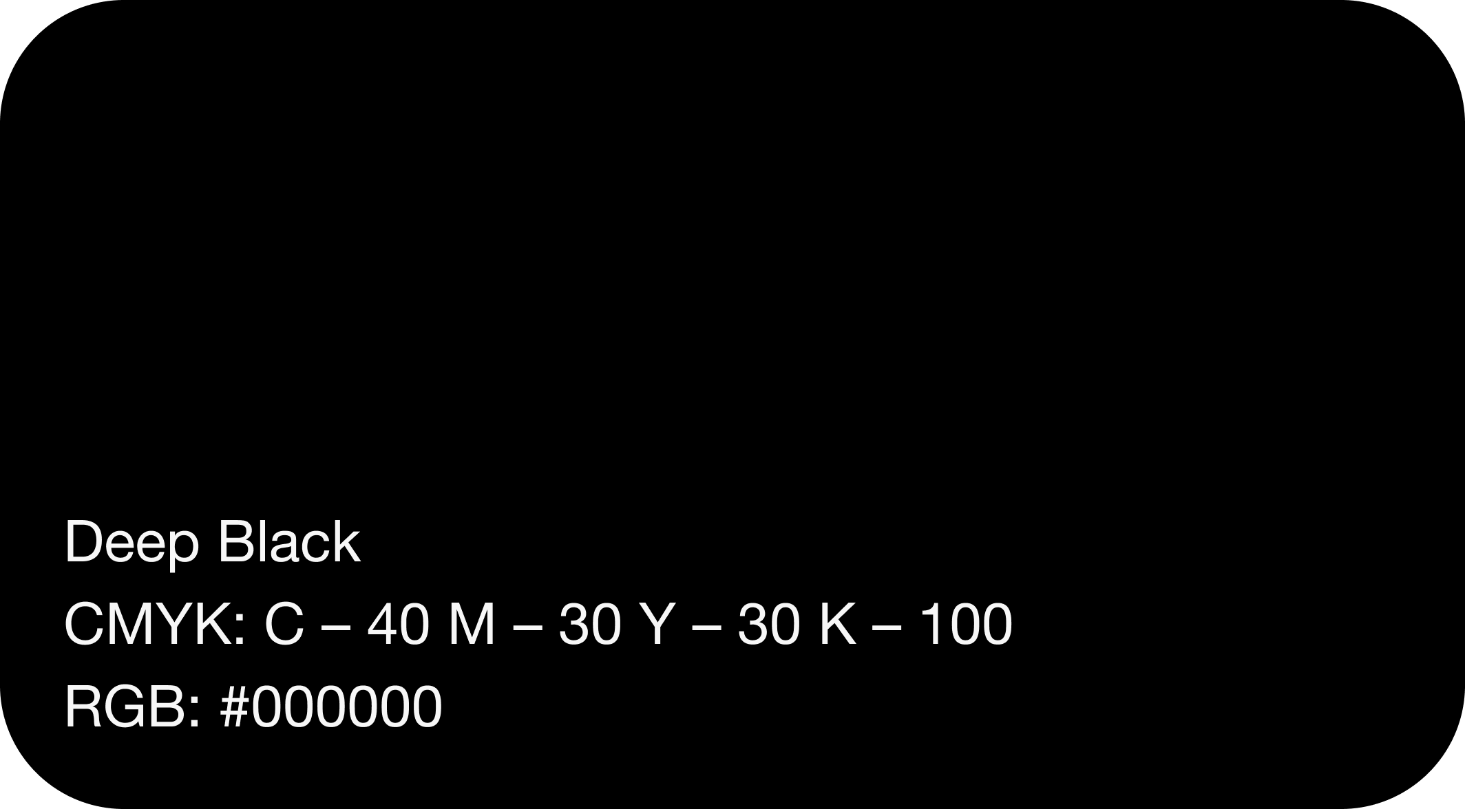
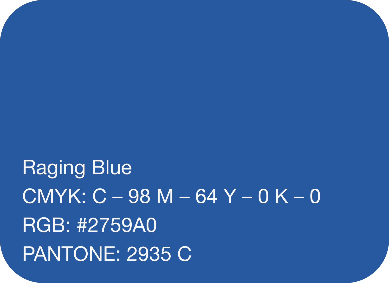
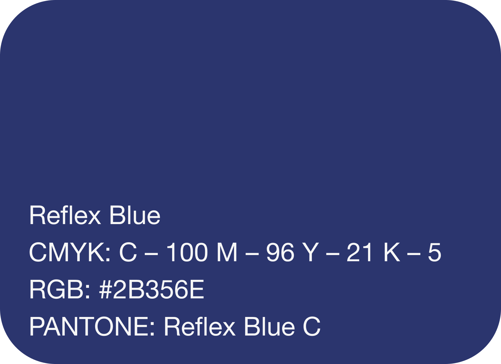
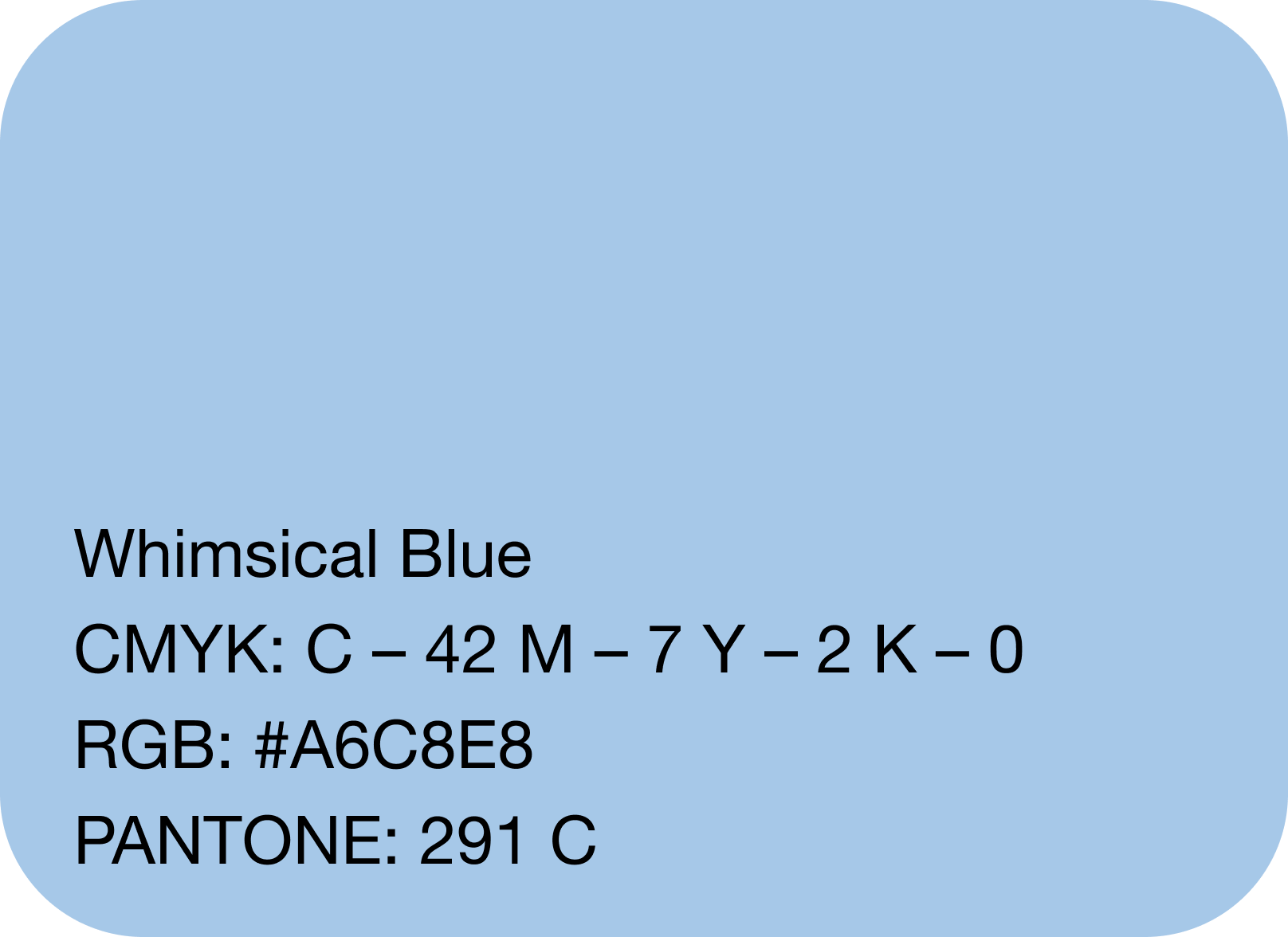
color palette
This palette was chosen to balance professionalism, trust, and approachability. The range of blues establishes a strong sense of stability and credibility, with the deeper tones reinforcing authority and reliability, while the lighter hues introduce calmness and accessibility. The vibrant Blue Chromium injects energy and modernity, ensuring the brand feels dynamic and forward-thinking. Ultra White and Subtle Grey provide clarity and neutrality, creating space for content to breathe and allowing the stronger colors to stand out. Finally, Deep Black grounds the palette, adding contrast and strength to the overall identity.


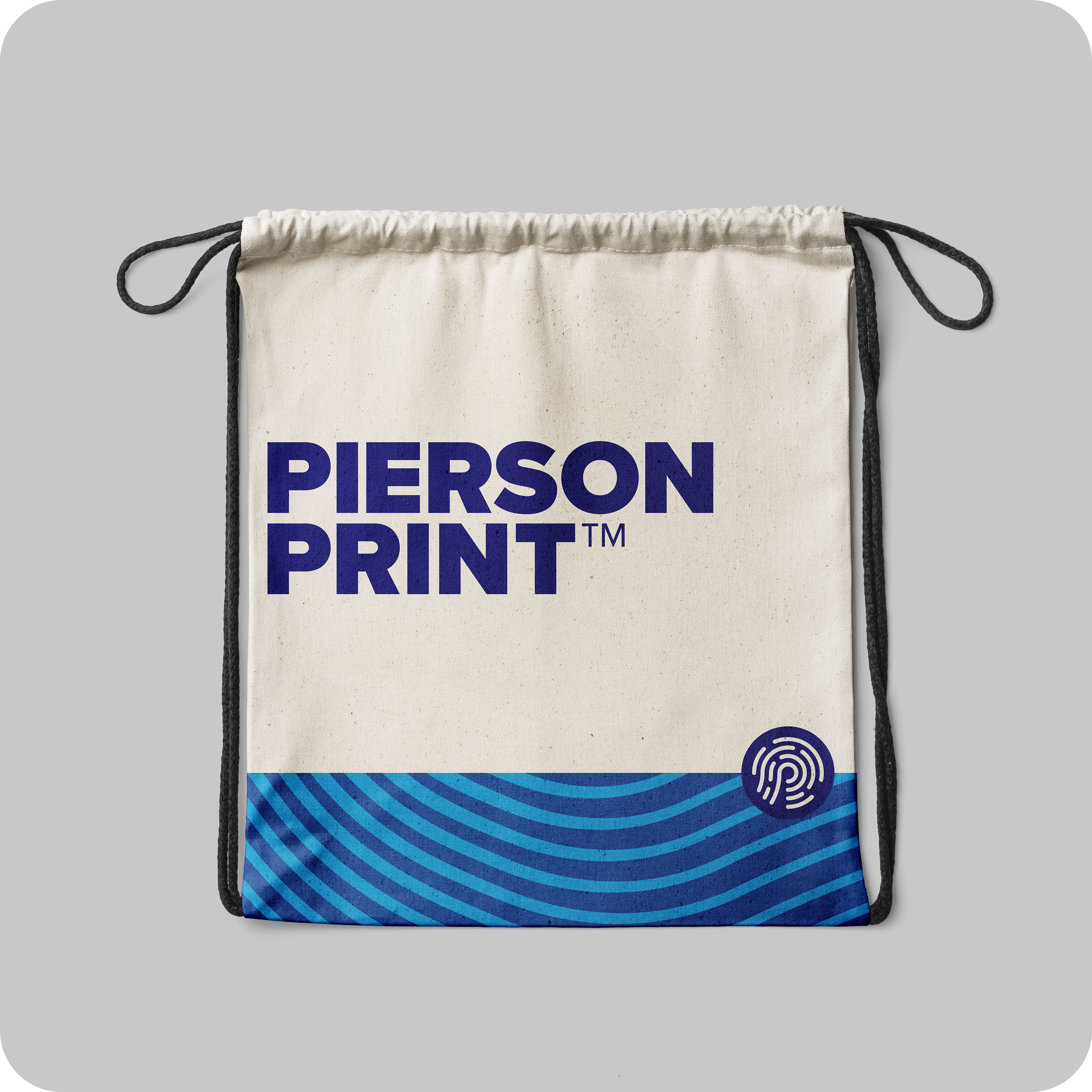
packaging
We chose the fingerprint as the centerpiece of the brand identity because it perfectly reflects the idea of “Leaving Your Mark.” A fingerprint is one-of-a-kind, just like every client and every project we take on. It represents individuality, authenticity, and the lasting impression the brand creates. By weaving fingerprint patterns into packaging, merchandise, and other touchpoints, the design feels connected and memorable. The flowing lines also add a sense of energy and movement, showing that the brand isn’t just static — it’s active, bold, and always making an impact.