100%
Creative Director
Emmanuel Prissette
Art Director
Stu Alfano
Designer
Ricky Peterson
Challenge
concept an eyewear campaign, showing products from Spring 2023-4 season utilizing action/lifestyle photos. Create a suite of social assets for Instagram.
history of the brand
The 100% brand has always been synonymous with motocross Americana and has been linked to many iconic moments that have built the roots and history of what is modern motocross.

the glendale
The GLENDALE achieves the perfect balance of timeless styling melded with premium frame and lens technology that distinguished riders expect. The ultra HD™ lens technology delivers crystal-clear vision, Hydrophobic and Oleophobic lens treatment repels water, dirt, and oil, 5.5-base cylindrical shield lens for zero distortion. they also are available with HiPER® lens technology for increased depth perception along with them being available with Photochromic lenses with adaptive tint for all light conditions.

APPROACH
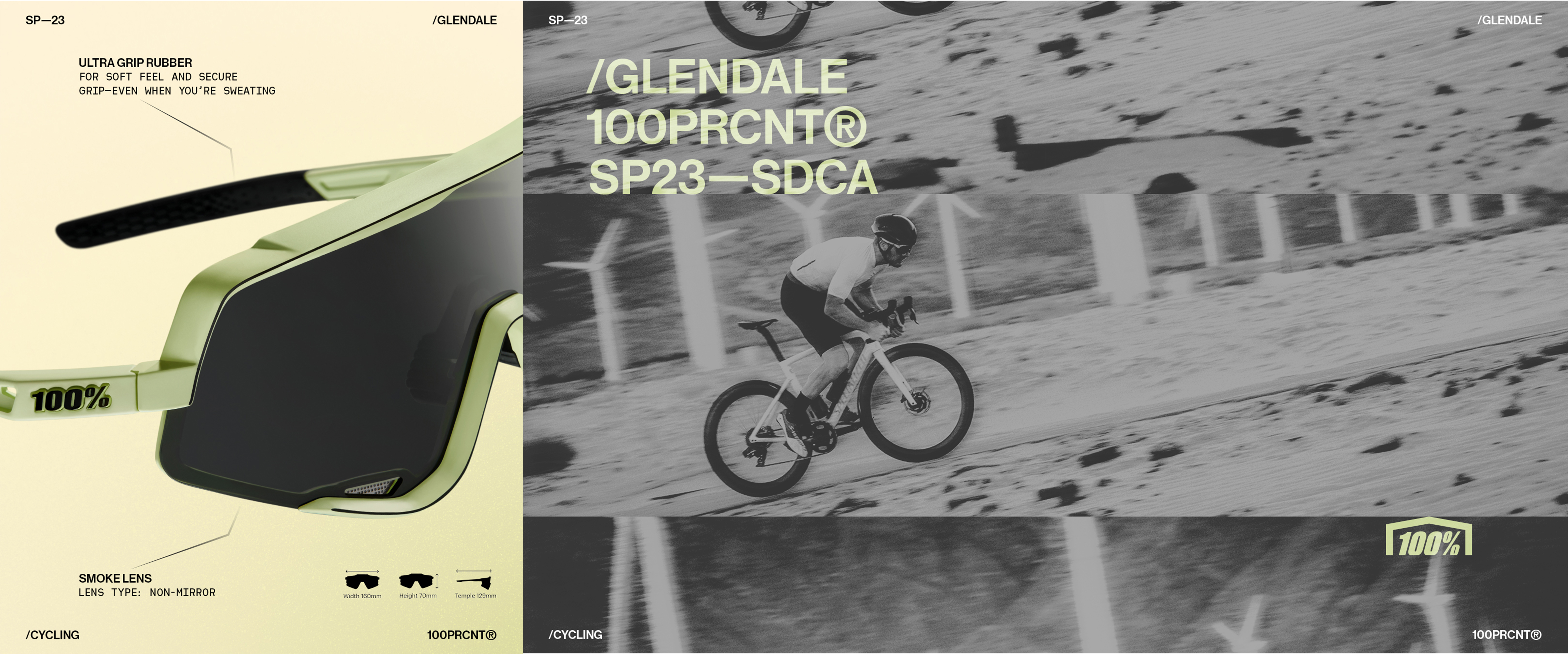
100% has a product — the Glendale, a high-performance cycling sunglass — and a season launch to promote. What they needed was a point of view. The reference the work started where it always should: with research. The moodboard pulled from the sharpest corners of action sports and performance culture. Nike's After Dark campaigns. Film grain photography shot at dusk. Archival racing imagery from across California's roads. Not to copy the aesthetic, but to understand the visual language the audience already lived in and respected.The Concept SP23 SDCA. San Diego to California. A route, a season, a feeling. The kind of specificity that turns a product launch into a moment you actually want to be part of.The Execution The carousel was built around two modes: ,the athlete in motion and the gear up close. Film grain, tight crops, desaturated tones, and utility-style data overlays gave every frame the gritty authenticity that performance audiences distrust when it's missing. The Detail The product shot — the Glendale against a muted sage background with clean technical callouts wasn't just an aesthetic choice, it was a bridge between the lifestyle world and the performance specs that serious cyclists actually care about.The result, a social campaign that felt less like advertising and more like a rider's camera roll. Every frame earned its place. Every detail reinforced a single idea: this is gear made for people who actually show up.


art direction
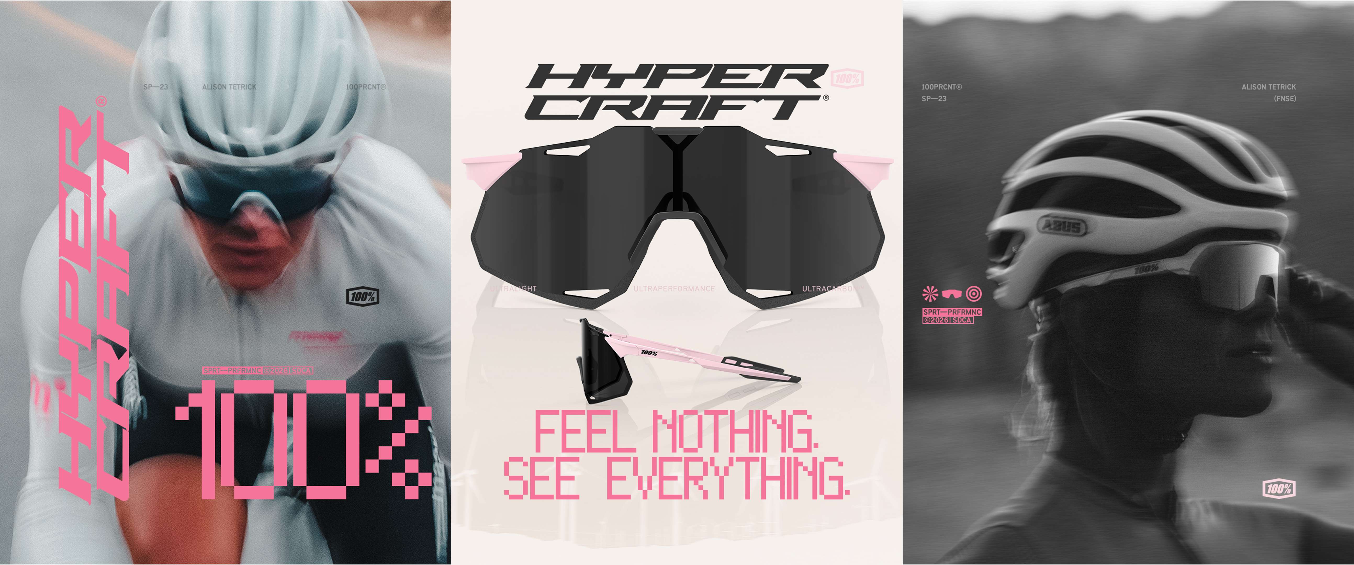
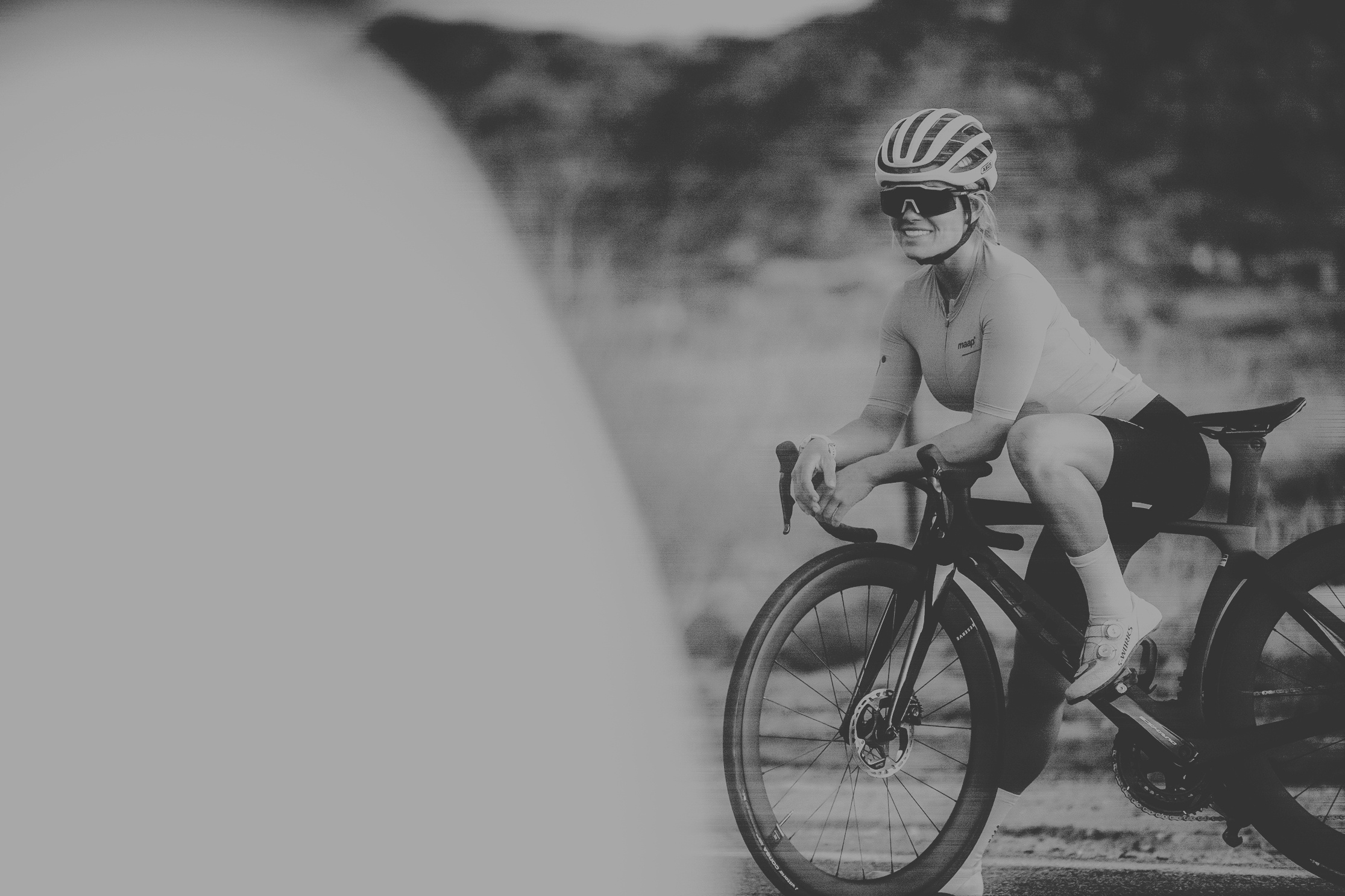
The Shift to V2 was a different animal. Same brand, new product, new energy. The Hypercraft has a cleaner silhouette and a more premium material story — UltraCarbon, UltraLight, UltraPerformance — and the art direction had to match that ambition without losing the raw athletic credibility 100% is built on.The Reference The moodboard shifted accordingly. References leaned into the tension between performance tech and streetwear culture. Oakley's tech-forward product layouts. Jordan Brand's event graphics. The dense utility typography you find in aerospace manuals and limited-release drops. The goal was to find where high fashion and high output actually intersect — because that's exactly where the Hypercraft lives.The Color Pink became the campaign's sharpest tool. Anchoring everything in hot pink against desaturated black and white photography wasn't decorative, it was strategic. Pink reads bold and unexpected in a category dominated by blacks, reds, and neons. It made the product feel like a statement without saying anything out loud.The Athlete Building the campaign around Alison Tetrick, a pro cyclist and FNSE rider, grounded the aesthetic in legitimacy. Every frame was shot close, slightly blurred at the edges, kinetic — the kind of image that feels captured mid-race, not posed for a brand shoot.The Line "Feel Nothing.
See Everything." Six words that carry the entire product promise and leave nothing on the table. The art direction's job was simply not to get in the way of that line — and to make sure every frame earned it.